
The Center for Media and Public Affairs at George Mason University
CMPA is a nonpartisan research and educational organization which
conducts scientific studies of the news and entertainment media.
conducts scientific studies of the news and entertainment media.


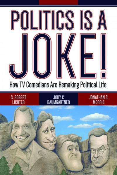
Politics is a joke! : How TV Comedians Are Remaking Political Life
By S. Robert Lichter, Jody C Baumgartner, and Jonathan S. Morris
Does late night political humor matter? Are late night comedians merely entertaining, or do they have the power to influence the way we think about politics and politicians? Politics is a Joke! demonstrates how the public turns to late night comedy for political information and is in turn affected by it.Using exclusive data from the Center for Media and Public Affairs, the authors conduct a detailed and exhaustive analysis of political jokes on late night shows dating back to 1992.
Drawing on examples from comedians like Jay Leno, Jon Stewart, and Stephen Colbert, the authors pinpoint the main targets and themes of late night comedy and examine its impact on political institutions and politicians. Politics is a Joke! is essential reading for anyone who wants to understand the crucial role late night comedy plays in our political universe—and for anyone who enjoys a good laugh. Read More
Drawing on examples from comedians like Jay Leno, Jon Stewart, and Stephen Colbert, the authors pinpoint the main targets and themes of late night comedy and examine its impact on political institutions and politicians. Politics is a Joke! is essential reading for anyone who wants to understand the crucial role late night comedy plays in our political universe—and for anyone who enjoys a good laugh. Read More
Featured Study
EXPERT OPINION ON REGULATORY RISK ASSESSMENT
A Survey by the Center for Media and Public Affairs (CMPA) and Center for Health and Risk Communication (CHRC) at George Mason University Read More (PDF)
A Survey by the Center for Media and Public Affairs (CMPA) and Center for Health and Risk Communication (CHRC) at George Mason University Read More (PDF)